Introduction
Maroon and burgundy, two seemingly similar hues, often ignite confusion among color enthusiasts. While they share a common ancestor in red, subtle nuances distinguish them, creating a distinct visual experience. This comprehensive guide explores the intricacies of maroon and burgundy, unraveling their differences and highlighting their unique applications.

Origins and Etymology
Maroon, derived from the French word “marron,” meaning “chestnut,” embodies the deep reddish-brown hue of chestnuts. Burgundy, on the other hand, traces its name to the Burgundy wine region in France, renowned for its rich, dark red wines.
Color Theory and Perception
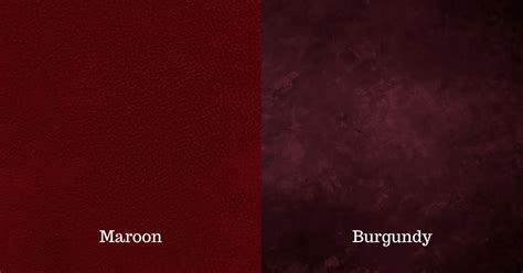
In the realm of color theory, maroon and burgundy occupy neighboring positions on the color wheel. However, their differences become apparent under closer examination. Maroon leans towards a brownish undertone, exuding warmth and sophistication. Burgundy, in contrast, exhibits a slightly purplish cast, lending it a touch of elegance and opulence.
Shades and Variations
Maroon can range from a vibrant reddish-brown to a deep, almost chocolatey hue. Burgundy, too, boasts a spectrum of shades, from a luxurious deep red with a hint of brown to a more vibrant crimson-red.
Applications in Design
The distinct characteristics of maroon and burgundy make them versatile choices for interior design, fashion, and other creative pursuits. Maroon, with its warm and earthy tones, evokes a sense of comfort and stability. It is often employed in traditional and classic settings, such as libraries, living rooms, and formal attire. Burgundy, with its rich and sophisticated aura, commands attention and conveys a sense of luxury and opulence. It shines in elegant spaces, such as dining rooms, ballrooms, and evening gowns.
Table 1: Shades of Maroon and Burgundy
| Shade | Maroon | Burgundy |
|---|---|---|
| Deep Reddish-Brown | ✓ | ✗ |
| Chocolatey Brown | ✓ | ✗ |
| Dark Red with Hint of Brown | ✗ | ✓ |
| Crimson-Red | ✗ | ✓ |
Color Psychology
Colors evoke psychological responses, and maroon and burgundy are no exception. Maroon is associated with stability, strength, and sophistication. It is often seen as a symbol of power and authority. Burgundy, on the other hand, conveys luxury, elegance, and passion. It is associated with wealth, power, and romance.
Table 2: Color Psychology of Maroon and Burgundy
| Color | Psychological Association |
|---|---|
| Maroon | Stability, Strength, Sophistication |
| Burgundy | Luxury, Elegance, Passion |
Cultural Significance
Maroon and burgundy have cultural significance in various parts of the world. In the United Kingdom, maroon is the traditional color of academic robes, signifying the wearer’s position as a scholar. Burgundy, in China, is associated with luck and prosperity, making it a popular choice for traditional garments and decorations.
Table 3: Cultural Significance of Maroon and Burgundy
| Color | Cultural Association |
|---|---|
| Maroon | Academic Robes (UK) |
| Burgundy | Luck and Prosperity (China) |
Complimentary and Contrasting Colors
To create harmonious color combinations, it is crucial to consider complementary and contrasting colors. For maroon, complementary colors include green and turquoise, while contrasting colors include yellow and orange. Burgundy complements blue and teal, and contrasts well with green and yellow.
Table 4: Complementary and Contrasting Colors for Maroon and Burgundy
| Color | Complementary Colors | Contrasting Colors |
|---|---|---|
| Maroon | Green, Turquoise | Yellow, Orange |
| Burgundy | Blue, Teal | Green, Yellow |
Tips and Tricks for Using Maroon and Burgundy
– Use maroon as an accent color to add warmth and depth to a space.
– Pair burgundy with gold or metallic accents for a luxurious look.
– Use burgundy as a backdrop for artwork to create a sense of sophistication and elegance.
– Consider using maroon and burgundy in traditional or classic settings.
Conclusion
Maroon and burgundy, while similar in appearance, are distinct hues with unique properties and applications. Maroon exudes warmth and stability, while burgundy conveys elegance and opulence. Understanding their differences and embracing their strengths allows for creative and impactful use in design and other creative endeavors.