Understanding the Defining Characteristics
Maroon and burgundy are two deeply saturated shades that evoke a sense of elegance, sophistication, and warmth. While often mistaken for one another, they possess subtle yet distinct differences that set them apart.

1. Hue and Saturation
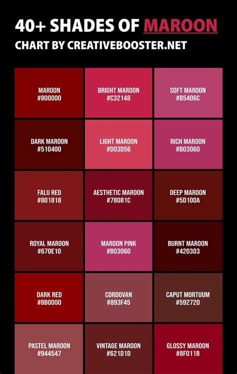
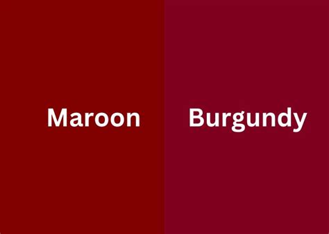
The primary distinction between maroon and burgundy lies in their hues. Maroon is a dark shade of red that leans towards brownish tones, whereas burgundy is a deep shade of red with a purplish undertone. This difference in hue is due to the varying proportions of yellow and blue pigments in the color mixture. Maroon has a higher concentration of yellow, while burgundy has a higher concentration of blue.
2. Lightness and Value
In terms of lightness or value, maroon is typically darker than burgundy. This means that maroon absorbs more light, while burgundy reflects more light. As a result, maroon appears as a richer, more somber shade, while burgundy has a more vibrant, lighter appearance.
3. Color Code
The hexadecimal color codes for maroon and burgundy further illustrate their differences. Maroon is represented as #800000, while burgundy is represented as #800020. The difference in the last two digits (00 and 20) indicates the higher blue content in burgundy.
Applications and Aesthetics
1. Fashion and Design
Maroon and burgundy are versatile shades that are widely used in fashion and design. Maroon evokes a sense of formality and authority, making it suitable for suits, tuxedos, and other dressy attire. Burgundy, on the other hand, is more vibrant and playful, making it a popular choice for casual wear, accessories, and interior design.
2. Marketing and Advertising
Both maroon and burgundy are effective colors for marketing and advertising campaigns. Maroon can convey a sense of luxury, stability, and quality, while burgundy can stimulate excitement, passion, and desire. Companies often use these shades for branding, packaging, and promotional materials to evoke specific emotions and associations.
3. Art and Culture
Maroon and burgundy have a rich history in art and culture. Maroon was a popular color in the Victorian era, symbolizing mourning and loss. Burgundy, on the other hand, has been associated with royalty and wealth for centuries. Both shades are still commonly used in paintings, sculptures, and other artistic expressions.
Customer Needs and Benefits
Consumers are drawn to maroon and burgundy for a variety of reasons. These shades can meet specific needs and provide unique benefits, such as:
1. Sophistication and Style
Maroon and burgundy are both elegant and stylish shades that can enhance the appearance of individuals and spaces. They convey a sense of refinement and sophistication, making them ideal for those seeking a polished and professional look.
2. Emotional Appeal
Maroon and burgundy have strong emotional associations. Maroon can evoke feelings of comfort, stability, and warmth, while burgundy can stimulate feelings of excitement, passion, and confidence.
3. Practicality and Versatility
Maroon and burgundy are versatile shades that can be paired with a wide range of other colors. They are suitable for both formal and casual occasions, making them a valuable addition to any wardrobe or design scheme.
New Applications and Creative Innovations
1. Maroonized Technology
The term “maroonized” could be coined to describe new applications that leverage the deep red-brown hue of maroon. For example, maroon could be used for high-resolution displays, providing richer colors and enhanced contrast.
2. Burgundy Revolution
The “burgundy revolution” could refer to a surge in the use of burgundy in various industries. For instance, burgundy could be used to create innovative fabrics with unique textures and properties.
Conclusion
Maroon and burgundy are two distinct and captivating shades that offer a wealth of applications and benefits. They evoke a range of emotions, embody sophistication and elegance, and possess a rich history in art and culture. By understanding the subtle differences between these two shades, consumers and designers can make informed choices that enhance their aesthetic appeal and meet their specific needs.
Tables
Table 1: Color Code Comparison
| Shade | Hexadecimal Code |
|---|---|
| Maroon | #800000 |
| Burgundy | #800020 |
Table 2: Lightness and Value Comparison
| Shade | Lightness (0-100) | Value (0-255) |
|---|---|---|
| Maroon | Darker (approx. 30) | 128 |
| Burgundy | Lighter (approx. 50) | 192 |
Table 3: Emotional Associations
| Shade | Emotional Associations |
|---|---|
| Maroon | Comfort, stability, warmth |
| Burgundy | Excitement, passion, confidence |
Table 4: Customer Needs and Benefits
| Need | Benefit |
|---|---|
| Sophistication and style | Polished and professional look |
| Emotional appeal | Emotional connection |
| Practicality and versatility | Versatile for various occasions |
